I build & use design systems and component libraries all the time. One of the hardest problems is naming things. It sounds simple but the choices you (un)intentionally make here have wide reaching effects.
How does the system choose to expose this variant to users of the system? What are the available options that should exist in all components that expose “size” as a knob to tune?
Design systems are complicated enough and intentionally choosing a pattern will greatly help the adoption of your system and help your users ramp up.
One of my pet peeves is incoherent variant options. We'll use a very common variant as an example in this post: “size”. Some systems take a T-Shirt sizing approach (S, M, L, etc..), others take a number approach (1, 2, 3, 4). If you go t-shirt sizing, do you support “small”, “S”? My personal take is that what approach you take doesn't matter too much as long as the potential values of the variant use a unified approach across the system holistically and it is clear.
The system should have one set of options available for any size variant that exists in the system. For instance, the button could allow small, medium, large and the card could allow medium, large, but the system should only allow xsmall, small, medium, large, xlarge as the options available.
Making it harder to screw it up
Here's a a way to codify this in Typescript so that the system remains cohesive as it and its components evolve over time.
For this approach, I'll be using CVA to declaratively define the variants for a component.
The first part is to define the available options that the system allows, we'll use a type union for this as it's a great fit here.
/**
 * SizeUnion is a union of all the possible sizes that a component can have.
 */
export type SizeUnion = 'xsmall' | 'small' | 'medium' | 'large' | 'xlarge'
The next part is small utility that will enforce what the variant prop is and the available options that are exposed to a component via CVA in the format that CVA wants.
export function size<U>(sizeOptions: Record<Extract<SizeUnion, U>, string[]>): {
  size: Record<Extract<SizeUnion, U>, string[]>
} {
  return {
    size: sizeOptions,
  }
}
Finally, we use this in the CVA definition and for our component:
import { cva } from 'class-variance-authority'
import { size } from '../type-utils'

import './styles.css'

export const buttonCVA = cva(['button-base'], {
  variants: {
    ...size<'small' | 'medium' | 'large'>({
      small: ['button-small', 'typography-x-small-label'],
      medium: ['button-medium', 'typography-small-label'],
      large: ['button-large', 'typography-medium-label'],
    }),

  },
})
One thing to note here is that our type utility allows the component what variant values they're exposing but enforces what options are available and then enforces that the component is actually exposing those options. Here's what our card declaration would look like for our earlier example:
import { cva } from 'class-variance-authority'
import { size } from '../type-utils'

import './styles.css'

export const buttonCVA = cva(['card-base'], {
  variants: {
    ...size<'medium' | 'large'>({
      medium: ['card-medium'],
      large: ['card-large'],
    }),

  },
})
Finally, on the actual component we'll leverage CVA's VariantProps type utility to make sure that this variant's options are baked into the component's props. Here's an example with React:
import { ComponentProps } from 'react'
import { VariantProps, cx } from 'class-variance-authority'
import { Expand } from '../type-utils'

import { buttonCVA } from './styles'

export type ButtonProps = ComponentProps<'button'> &
  Expand<VariantProps<typeof buttonCVA>>

export const Button = (props: ButtonProps) => {
  const {
    size = 'medium',
    className,
    ...rest
  } = props

  return (
    <button
      className={cx(
        buttonCVA({
          size,
        }),
        className,
      )}
      {...rest}
    />
  )
}
Eagle eye readers will have spotted another type utility we're leveraging. Expand just allows Typescript to nicely output the actual union's options we've defined and not everything from the system's options. It looks like this:
export type Expand<T> = T extends unknown
  ? { [K in keyof T]: Expand<T[K]> }
  : never
The developer experience this provides to users of your system is top level.
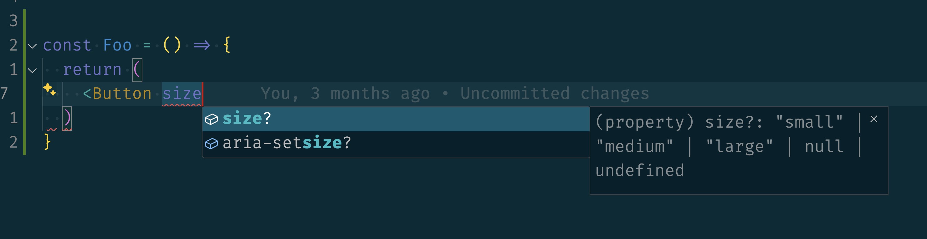
Users of the component see only the options available to this component. Developers of the system can only use the options the system allows, and then enforces that they've properly exposed those options.
This is just one way to solve this, got another idea? Would love to hear about it; drop me a note about it or your thoughts on this approach: [email protected]